

This is the biggest, coolest project I've done in comics so far, and I'm really proud of how it's turned out. I've worked harder on this than I have on anything before, so I thought I'd share some of the process that went into this book.

 | |
| Magnus design by Neil Edwards |


When it came to the future city of NorthAm, we wanted it futuristic but not unrecognizable. There are flying cars and robots everywhere, but also plenty of elements from the modern world.

And then came the really fun stuff: ROBOTS ON ROBOTS ON ROBOTS


Direction at the time when I worked out these robots sketches was pretty loose, so I was able to really just do whatever and have fun. I tried to come up with a good mix-from clunky rust buckets to sleek humanoids, all shapes, all sizes, anything goes. So much fun. More than a few of these initial designs make it into the the series in various ways, and there's more still to come...
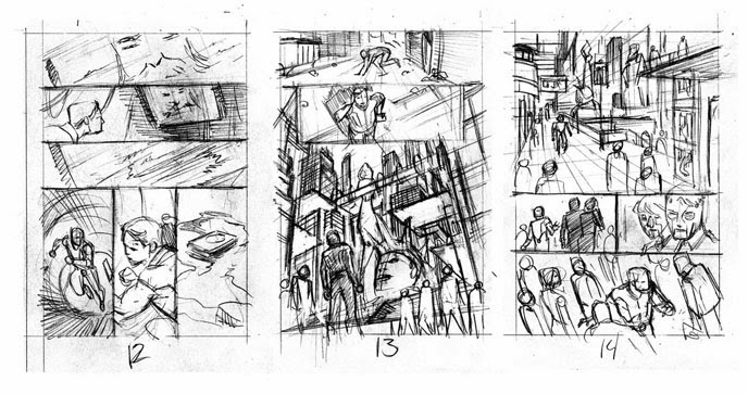
Here are the pencils and inks for the pages that have made it online as part of the preview-


And here are my initial layouts for those pages, for those that like seeing this stuff (like me). I did three versions of the the double page spread layout before we decided on version B. I don't usually do multiple layouts for the same page, but sometimes it's best to eliminate some ideas to find the best one.


You can see a full colored and lettered preview here


